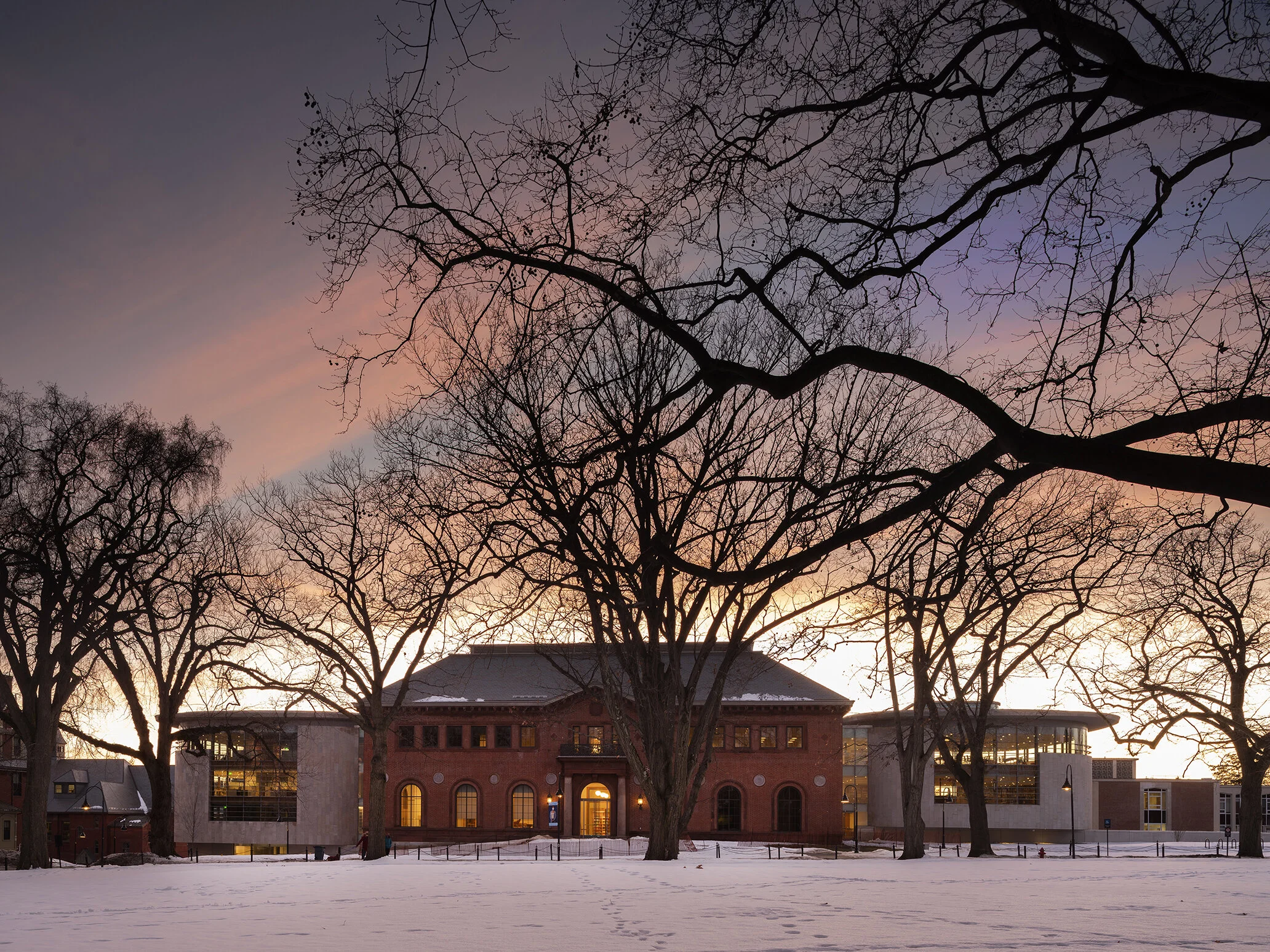
Neilson Library, 2021
Smith College, Northampton MA
Designer: Maya Lin Studio with William Bialosky, Architect
Executive Architect: Shepley Bulfinch
Landscape Design: Edwina von Gal + Co with Ryan Associates
Lighting Designer: Tillotson Design Associates
Photography: Nic Lehoux Architectural Photography
The design of the Smith Library arose from two main ideas. First, the Olmsted designed campus had over time become disconnected by large, masonry additions to the historic library building that blocked views and circulation through the heart of the campus. Second, the historic three story building had been converted to a six story building, creating low ceilings and cavernous spaces. Therefore, the new library design had to reconnect the campus both visually and spatially, it had to restore the historic openness of the campus, and it had to restore the library as a jewel in the center of the campus. It also had to create a library of the future- a weaving of the old and the new, where the historic campus is in dialogue with the new library, which will restore the feeling of openness, and of welcoming spaces that promote a sense of community, dialogue, and higher learning.
The plan of the building is a juxtaposition of two ideas: a “jewel box” that surrounds space, and a “jewel box” that is surrounded by space. In the former, the special collections storage volume is surrounded by a curvilinear space that becomes a place to study, work and read, and it is grounded by an inner glass box which houses the school’s most valuable special collections. In the latter, there is a central atrium that visually ties the floors together, and the perimeter of the building is lined in books, so you always feel the connection between the space and the program--the connection between the people and the books.
The materiality of the building is a mix of local stone, glass, metal and timber. These materials speak to the masonry tradition on the campus, as well as to modern construction techniques. For instance, the glass curtain wall of the round jewel boxes is supported by timber mullions, which have a very low carbon footprint. This brings together the old and the new--the exposed wood framing supports a high performance curved glass curtain wall.
The building is one of the most sustainable libraries in the US. There is a central oculus for daylighting, the window to wall ratio has been optimized for high performance, there are sun-louvers and double paned glass, the glazing is designed to prevent bird strikes, the building utilizes recycled materials, and the interior is red-list chemical free. The dense book storage area is sunken down by one story, and utilizes a tree filled sunken courtyard to bring in ambient natural light. The sunken area is also on a dedicated air handler, and utilizes the insulation value of the earth, to minimize energy consumption in the part of the building where there are stricter temperature and humidity controls because of the book preservation needs.
The landscape plan will have an arrangement of walks and plantings to create a natural flow of traffic through campus. There is an amphitheater that provides the site with shading, and areas for congregating and programming. It also creates the “hill” that restores the connection from the higher side of the campus to the lower side, which also restores the openness and the flow of the campus that Olmsted envisioned.
Related Press:
Lewis, Michael J. Like an Open Book. The Wall Street Journal (March 31, 2021)
Sokol, Brett. For Maya Lin, a Victory Lap Gives Way to Mourning. The New York Times (March 17, 2021)
Waddoups, Ryan. The Deeply Personal Story Behind Maya Lin’s Latest Project. Surface (March 23, 2021)


